01
Products, at first glance.
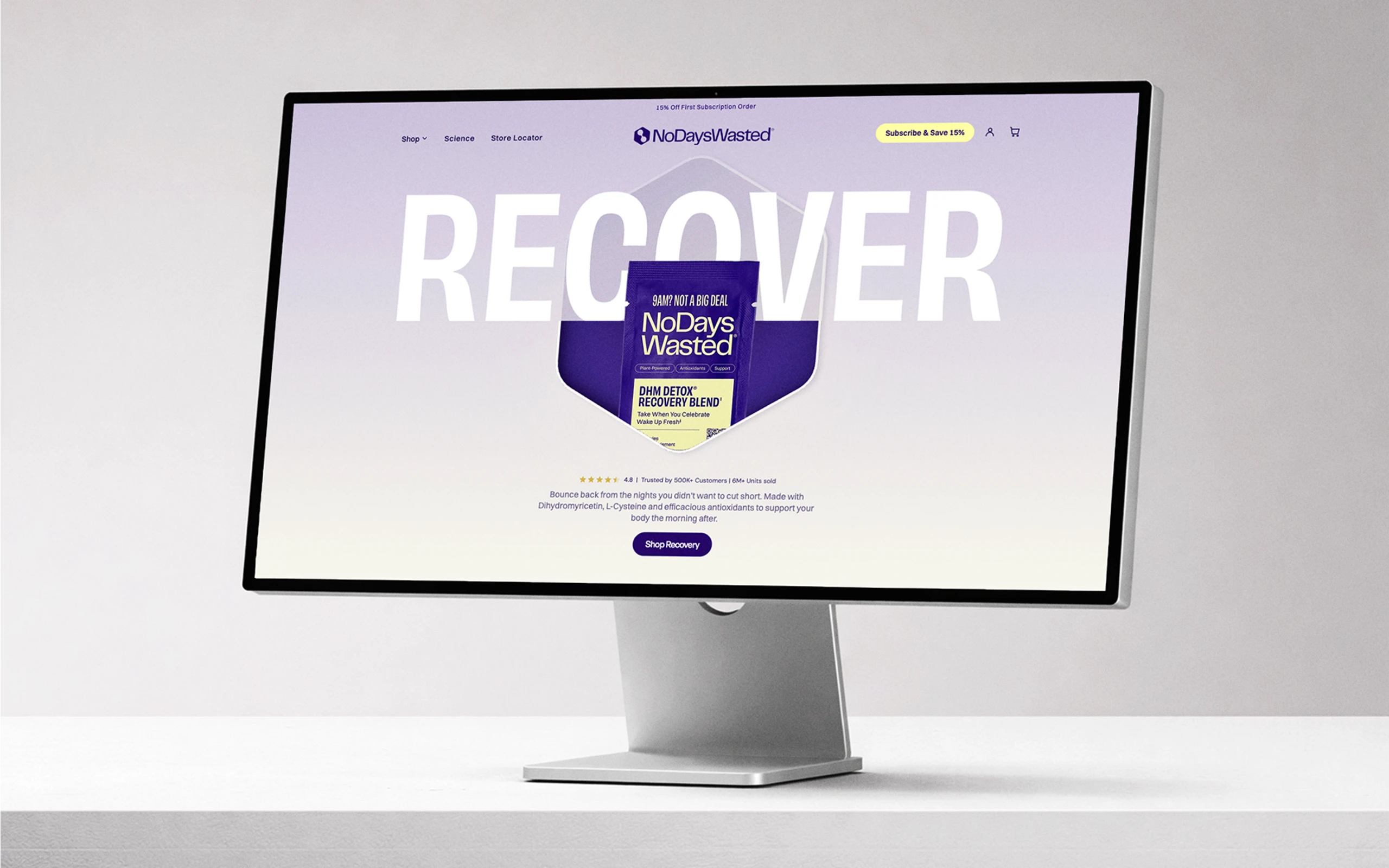
An animated hero shows the main products right away, so visitors understand what the brand sells before they scroll.
One brand,on every page
A recovery supplement brand selling in the US and Canada. Their website felt different from page to page, so the goal was a modern redesign that finally looks and feels like the brand.
Designed at Digital Arts Agency. Shown for portfolio purposes.
Every page used different styles, so the website didn't match the brand customers knew from the product.
One consistent visual system built from the brand itself, and a clearer shopping experience on both the US and Canadian stores.
An animated hero shows the main products right away, so visitors understand what the brand sells before they scroll.
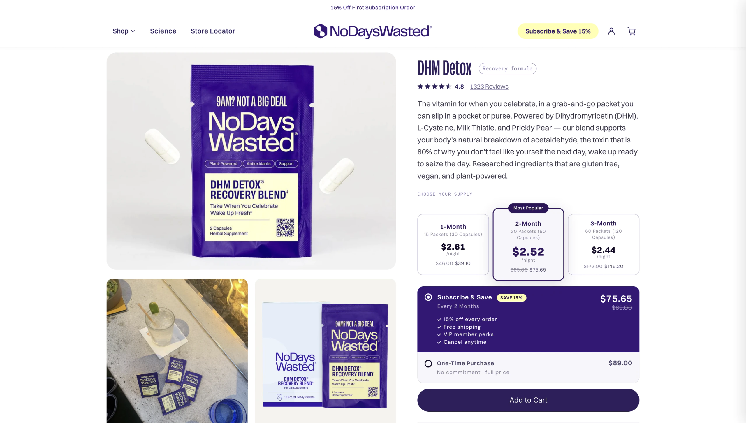
The product page clearly separates subscription and one-time purchase, so customers instantly see their options and savings.
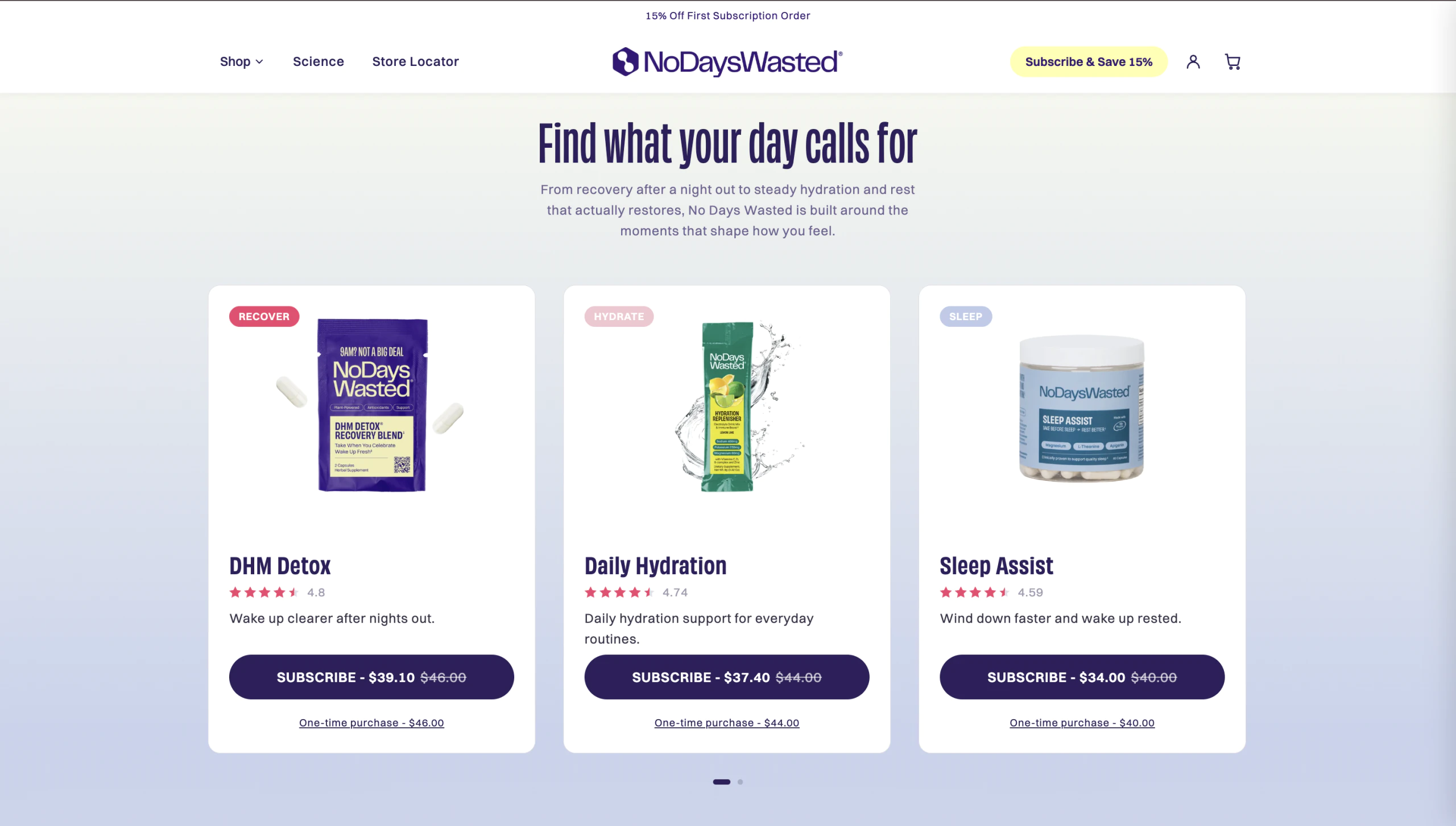
The same design system runs across the US and Canadian sites, keeping every page consistent.