Back to work
Brand Identity · Rebrand · MotionCase Study (04)
Sekundarac
A mark for turningwaste into value
An established metal recycling company and aluminium foundry with outdated branding. They needed a new logo that clearly shows what they do: buying and recycling metal, and their contribution to a sustainable future.
- Role
- Brand Designer
- Type
- Client work · Freelance
- Year
- 2023
- Deliverables
- Logo redesign, animation, stationery, promotional materials
One letter,full circle.
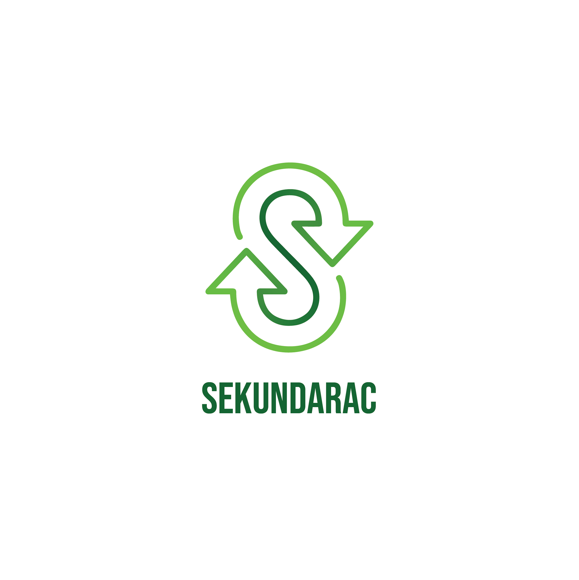
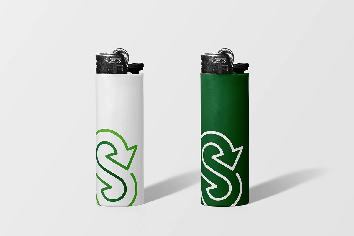
The letter S is formed from two recycling arrows, so the name and the mission become one sign. A bold condensed wordmark keeps it solid and industrial.
From cardto keychain.
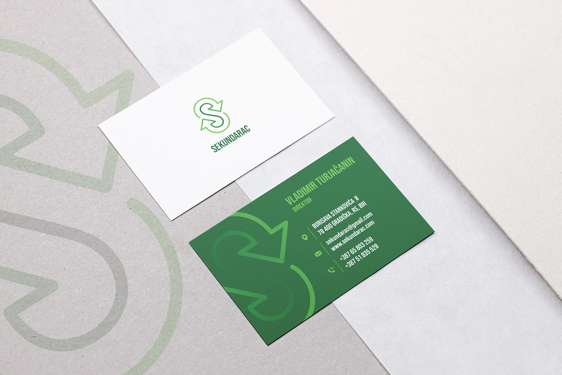
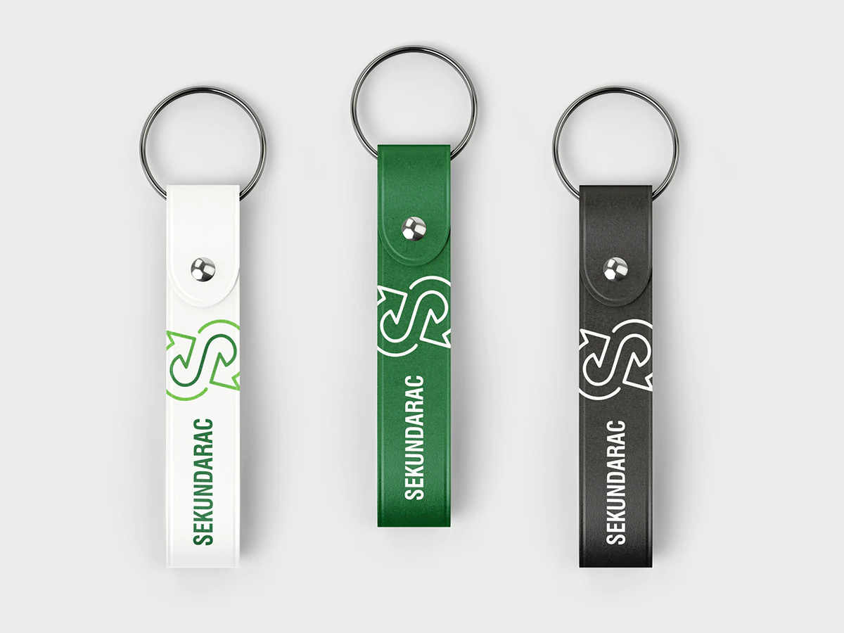
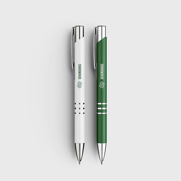
The new identity carries across business cards and promotional materials, in white, green and black versions.
Case Study (05)